Mobile Recommendations Best Practices
Overview
Mobile engagement is typically part of a broader, multi-channel customer journey in which shoppers use smartphones and tablets for product research and switch to desktop and bricks-and-mortar for purchasing. And it makes sense; shopping on a desktop device is a fundamentally different experience from shopping in-store—and it took some time for the mainstream to get used to it. Taking it to a step further, shopping on a handheld device is vastly different from shopping on a desktop, so it’s no wonder why less than 20% of digital commerce spending came from mobile (despite us being tethered to our smartphones). Closing the gap requires retailers to eliminate the friction in buying to create seamless experiences that allow customers to find and buy products as effortlessly as possible and we’re here to help. Following the layout guidelines on the pages that follow helps safeguard performance of Recommend on a retailer's site.
All sites are different, and what works best for one is not guaranteed to translate into gains for another. As such, treat this guidance as general best practices, a foundation for optimization from which site-specific tuning should occur. Understand the logic behind our optimization methodology and the questions to ask, so that you can adapt and apply as appropriate.
Mobile Recommendations
Fitting our recommendations best practices for mobile requires us to accept certain truths:
- Scarcity of space. Mobile devices have constrained viewports which limit the real estate available for placing content. As such, mobile experiences must deliver streamlined content and designs to avoid overwhelming customers with clutter.
- Mindshare wars. Mobile content always competes with other mobile apps and functions (Facebook, phone calls, text messages, random notifications) for the user’s attention. The longer it takes for a customer to carry out their objective, the greater the likelihood their shopping session will be disrupted.
- Different objectives. Mobile users are generally on the hunt for very specific information (i.e., they have a particular product in mind), while time-consuming efforts and discovery shopping are reserved for desktop devices. In fact, studies show that desktop visits last 3 times longer than mobile visits, with more pages viewed and half the bounce rates. Thusly, we assume that a mobile page view demonstrates more intent and interest in a product than a desktop page view.
- Different consumption. Mobile purchases tend to be cheaper, lower consideration products; consumption wanes for higher-ticket items such as computer hardware and electronics. While there is an opportunity to help shifting the purchase profile of mobile customers to an extent, it is largely beyond the capabilities of personalization.
To simplify, mobile users are utilitarian. Think of them as distracted, with less time to spend browsing, and often with a specific goal in mind —and that’s to get in, find the information they’re looking for, and get out.
Mobile-Specific Best Practices
We’re not reinventing the wheel with our mobile best practices, but there are some nuances that diverge from the desktop implementation. In essence, mobile recommendations need to internalize the mindset of the mobile customer and strike a balance between presenting thoughtful product suggestions and not upsetting the purchase flow.
Below are the main mobile best practice callouts:
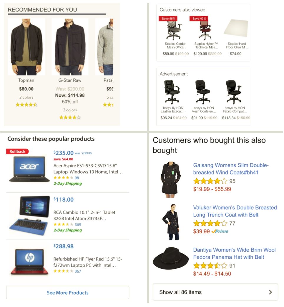
- With layouts, less is more. Depending on the page design, use horizontal and/or vertical layouts that showcase 2-3 products at a time (don’t try to cram more products into display). Both orientations should allow the shopper to view more products via a simple interaction. If a horizontal layout, utilize a carousel housing not more than 10 products and enable users to scroll through the swipe gesture. If a vertical placement, include a call-to-action to view more products.
- Ensure to use high resolution product images that are optimized for mobile devices. Also, limit product names within 2 lines; wherever applicable (for example, Apparel), consider removing product names completely if they don’t provide valuable information to the customer.
Below are example layouts that closely align with mobile best practices:

- Focus on pages where consideration can safely place. Home, Item, and Add-to-Cart are the key page types for mobile recommendations, with Category page placements adding some value. The Home page’s importance is elevated due to it being a common landing page and the urgency around getting customers in front of relevant products as quickly as possible, before the customer is distracted from their current session. Whereas recommendations can get lost on desktop home pages due to the size of the page and competing content, they become much more conspicuous on mobile devices, so this is a great opportunity to lure customers with personalized suggestions.
- Recommendations can be included on Cart but we’re not strong proponents as they can disrupt the customer from completing that rare mobile conversion. If they are to be included, they should be at the bottom of the page—below the Cart contents and the checkout call-to-action.
- Search and Sub-category (list) pages are not effective locations for recommendations due to their page length. However, these are certainly prime areas for Find and Discover respectively.
- Streamline the strategy messaging. There are obvious page width constraints with mobile devices. When necessary, use alternate strategy messages to avoid multiple lines of wrapping text. Statements such as “People who viewed this also viewed” can be condensed to “People also viewed” without losing efficacy.
- Make navigation easy. For mobile, we strongly recommend adding, at launch, a Recently Viewed Items placement at the bottom of every page. This provides a helpful breadcrumb trail that accelerates customer navigation.
- Invest in quality cross-sells. Cross-selling has an elevated priority on mobile. Remember, customers visit mobile sites with specific intent; so, rather than prioritizing the display of alternative products, something we commonly do on desktop. We acknowledge the customer’s interest in the item(s) that brought them to the site and present relevant options to complete their purchase.
- It’s important to cultivate mature cross-sell recommendations that represent truly incremental buys rather than a replacement for the current item. Also, given what we know about the mobile customer’s propensity to purchase low-ticket items or more impulse buys, it’s preferred that we cross-sell reasonably priced products that don’t require much consideration. For example, on mobile, it’s easier to sell the TV customer an $20 HDMI cable than a $500 stand. Consider Advanced Merchandising, offline POS data, and/or price boosts to better-curate cross-sells.
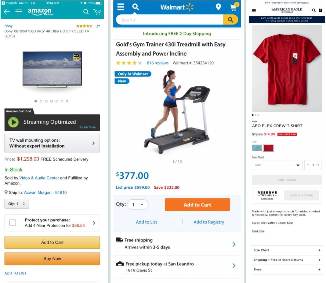
- Prioritize cross-selling on the Item page. Mobile Item pages can support 3-4 placements. However, almost all of these should be positioned towards the bottom of the page, interspersed within or below the product descriptions and reviews, and display similar items or personalized recommendations. The top-most placement should be a “bundle” recommendation (for example, “Frequently Bought Together” or “Complete the Look”). Ideally, it will enable the customer to add the current item to Cart along with 1-3 complementary items through a single click, though we know this may not be possible within configurable verticals such as Apparel. Because this placement merchandises the incumbent product, it can be slotted above the product descriptions and reviews.
Below are the examples of bundle/cross-sell placements on popular mobile sites/apps:
